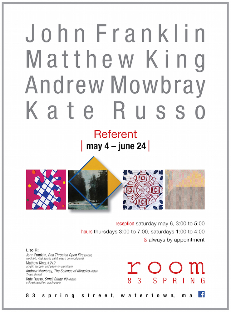
Room 83 Spring’s latest show, Referent, features the artwork of John Franklin, Matthew King, Andrew Mowbray, and Kate Russo.
What agency does geometric abstraction have in the 21st century? Defying easy artistic categorization, John Franklin, Matthew King, Andrew Mowbray, and Kate Russo employ the modernist idiom in a retooled mind-tangle of pop culture and social relevance. Relational and humanist, the hard edge is rendered expressive, softened by the human hand and choice of materials. Flatness becomes dimensionally resonant, confounded by stitching, cutting, and ritualized practice. Abstraction is embodied, full of story and life essence.
Optically charged, the work of Franklin, King, Mowbray, and Russo has pitch- perfect legibility and high-intensity eye appeal. And yet the decorative lure opens a conceptual curtain for the viewer, revealing a slow-release performative experience of time, memory and intent. Each work emits cues, which reference a particularity, indicate action, suggest narrative, and intimate presence. In addition, the paintings, drawings and collage incorporate a host of ready-mades: commercial felt, Tyvek, asphalt, particle board, photography, the printed grid, which in themselves unpack layers of meaning. Thus the visual read is fresh and binary: exacting and illusive, crystal clear and inconclusive, concise and ambiguous.
John Franklin’s paintings combine the ceremonial with the personal. His love of fabrics is integral to expressing an intimate emotional and materially physical presence. Additionally, his work is influenced by an early interest in heraldry and its system of visual symbols defining family, tribe and class. In “Faithful Neighbor” the stark radiance of the dark central starburst ornamented by glowing orbs of blue and yellow on a field of saturated red wool felt is emblematic and evokes powers both super-hero and sacred.
The surfaces of his paintings appear quite firm at a distance, though upon closer inspection, the felt, silk or satin ribbons add elements of softness, suppleness and a taut sensuality to minimal hard-edge painting. “In the Hammock of Tangled Thighs” a white cord is laced through the painting’s surface in lazy loops connecting recessed dots of various hues and casting delicate shadows. Its lightness bespeaks innocence, but it is Franklin’s informed sense of art history at play, which stretches the vocabulary of modernism to suggest humans and hammocks while asserting a painting’s thingness.
“Though my art embodies concepts that are both soft and hard, intimate and distant, I endeavor to express the joys of life in tandem with the inevitability of suffering and sadness in our shared human existence. Invariably I aspire to make paintings that come down on the side of hope and promise while acknowledging personal fears, struggles and desires, proclaiming the beauty and bounty inherent in life.”
Matthew King makes paintings that function as both pictures and sculptures. The works are physically constructed objects that occupy space and insist on spatial presence. The wall becomes the crucial element – a defining element of the painting. Whether they lean on the wall, hang on the wall, or sit in front of the wall, they are paintings. The wall creates a kind of demilitarized zone between the thing and the viewer. “You can nail a chair to the wall and it will demand the consideration that only a painting can. I’m interested in that space—placing an object in the room like a piece of furniture, but maintaining a dictatorial control on perspective”.
King’s #’s 141 and 142 pack a perspectival punch out of construction grade particleboard. The illusion is further enhanced by the casual posture of the pieces propped up against the wall, which hint at King’s position, conflating painting with sculpture, flatness with depth and a sense of informality brought to formalism. The “paintings as objects” suggest open boxes or shipping crates absent the art or perhaps the art historical moment. Three smaller collages #’s 201, 212, and 214 incorporate the found photographic image and paint on aluminum. In these works, King further disrupts notions of time, space, and chronology. Here iconic imagery in tandem with elements of geometric hardedge abstraction is repurposed as ready-mades preserving while presenting anew a bracket of time – a vibe conserved.
Andrew Mowbray was originally drawn to Tyvek home wrap when he viewed it surrounding homes with sheets of layered, colored pattern. This patterning reminded him of quilts and quilting. Upon making this observation, he then took the material to his studio and carefully selected areas of the preexisting text and font. These selected swatches where then cut, arranged and sewed together to create, his own quilts and samplers.
Throughout history, the fabric and thread used by quilters have depicted scenes and motifs of historical and personal significance. The design motifs of the quilts Mowbray has been creating fluctuate between the decorative and pop cultural depictions of scenes and characters from his youth. “I feel my Tyvek quilts exist and function within this tradition and serve as registers of twentieth century American culture. Beyond the decorative beauty, traditionally quilts have also functioned as implements of warmth and comfort; they wrap, protect and insulate us. The role of Tyvek is similar in the way it wraps, protects and insulates domestic homes. I am interested in the dialogue, which is created when an industrial material, such as Tyvek intersects the handmade realm of craft. For me traditional quilts and Tyvek both function in similar ways and are domestic in nature. Tyvek is an exterior material and quilts an interior one. These thoughts and ideas fall in line with much of my artwork that explores and often questions both past and current notions and paradigms of masculinity and feminism.”
Kate Russo’s drawings explore the capacity of color and pattern to tell a story, create a setting, atmosphere or dialogue. With the grid as a backdrop, Russo composes drawings that speak to the role of color relationships and repetitive mark-making in how we understand place, personality and memory.
The inspiration for the Stage Series, comes from three-dimensional and performative sources. The drawings in this series have been inspired by the stage etchings in Gregorio Lambranzi’s New and Curious School of Theatrical Dancing: The Classic Illustrated Treatise on Commedia dell’Arte Performance. Russo references theatrical design to create an added sense of anticipation.
“The subtle and relentless mark-making creates a nervous energy not typically associated with the decorative designs that inform my practice, particularly domestic and architectural ornamentation.”
Russo’s quiet empty stages entice the viewer’s imagination and beg the question(s): comedy or tragedy, beginning or end, dimensional or backdrop? The thinking extends beyond the representation – the subtlety of the drawing quiets the mind and forces the eye to focus. Russo sets the stage for the viewer’s own drama.