City Manager George Proakis presented a possible idea for a new logo for the City of Watertown, which he hopes reflects Watertown and can be used on business cards, presentations, and signs around the City. The new design would not, he added, replace Watertown’s City Seal.
The logo will be discuss further by a City Council committee, said City Council President Mark Sideris, and a recommendation will come back to the full Council.
The logo is part of the City’s branding strategy, Proakis said, who added that the effort to create a new logo started in 2023 and it was designed by Sabastian Ebarb from the graphic design company Nahi.
“I think it reflects the water in Watertown — the Charles River — the movement, where we are headed,” Proakis said. “I think it reflects optimism, inclusivity, resilience and innovation.”
The logo is a circle made up of images with the appearance of moving water around a blank center, which would allow it to be tailored to different situations, Proakis said.
“One thing that concerned me is that everything from presentations to the way some of the documents go out from the City, everything is all over the place,” Proakis said. “Departments have different logos, they are different in different places. All kinds of different fonts and styles. We use everything, it is kind of all over the place.”
Former City Councilor Angeline Kounelis wrote to the Council asking who called for the new logo, and was concerned that the City Seal would be phased out.
“In my opinion, the new logo is a precursor to the gradual elimination of the City Seal, a segue to send the City Seal into obscurity for official purposes only,” Kounelis said.
Proakis told the Council that “this project will not affect the City Seal,” which has a circle with the words Pequossett, Watertown and In Pace Condita, around a scene with a Colonist and a Native American on the shore of the Charles River, and 1630 — the year of Watertown’s founding.
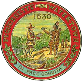
The City Seal does not work well in all situations, Proakis said.
“One of the challenges with the seal is the seal doesn’t scale well. It doesn’t scale well to letter head, it doesn’t scale well to particularly business cards,” he said. “It has a lot going on which makes it a great, beautiful, really extensively important piece of Watertown’s history. It hangs here in the Council Chamber and it tells an important story for us, but when you try to bring it down to the level of making a simple notable mark. There is a lot going on.”
The new logo will be discussed by the City Council’s Committee on Personnel and City Organization, Sideris said. If adopted, Proakis said that he plans to start using the logo slowly.
“We will move forward with a gradual rollout,” Proakis said. “No- or low-cost, mostly digital items like email signatures and new memo and PowerPoint templates will be available quickly, while other changes will be implemented over time. With limited exceptions, we will not replace physical items like business cards or vehicle decals solely for the purpose of adopting the new logo and brand.”
![]()
Municipal signs will not be replaced just to add the new logo, he added, but it could go on the signage at the new Parker Annex, where several City departments have or will be moving. The former school on Watertown Street was purchased by the City in early 2023.
See more examples of the draft logo by clicking here.
Nice logo! Clean. Simple, and so appropriate to WATERtown!
Proakis chugs along with those bullet points for his resume. “Branding strategy?” And of course we have consultants involved. This is too much, thanks for the laugh!
Please save our tax money and rather than paying yet another consultant, make designing a logo an open competition for all residents and public school kids. This logo looks like a woman with a bad haircut and a beard, or a mirror in a Disney cartoon. Those waves look oceanic not ripples and eddies like our river. Our library has a nice rippling logo on its newsletter and Community Rowing has two logos, one evocative of the river on its oars. I’m sure someone can come up with a more representative logo at no cost!
I don’t think this or any new logo is necessary. Use the seal that we have
The logo is not attractive but that’s beside the point.
Pat and Ken Davis
Well, I’ll give them this much, the current seal, is very busy. It doesn’t copy well, the details get all blurry.
Not sure that this is priority. I certainly hope they continue to use the existing stationary etc, till it runs out. Otherwise it’s dumb expense.
But the new itself “logo” is fine.
Is there any way you can post the seal on a letter head here?
It does not look like a wave – more like a girl with curls. The idea of the Charles River and the running current is a good one but the idea needs a better design.
Looks like a life saver.
I’m sorry, but with today’s technology there has to be a way to scale the old logo. Consult with a graphic designer or look into using a different program. What this is – is a poor excuse to continue to let the history of Watertown slip further and further away for some trendy curly q design. It looks like something I doodled in middle school in the margin of a notebook. Go to the You Know You’re From Watertown Facebook Page. No one likes it.
Boring…!
To me, the new logo seems to resemble a modern take on Victorian scroll work. It certainly will work framing a mirror or a photo of a great, great ancestor.
The current seal, now it may not work on cards or letterhead, and I can see that and understand it. The seal has a lot going on, including all the colors and the graphic of the people and background.
Can we rework that seal to no color, clean up and make the images clearer and do a simple black and white logo of the seal for business cards and letterhead so that it can be scaled to these items?
I see no need to reinvent the wheel here.
WHY WHY. There goes more American history. The logo we have is our Town our history. 1630 not 2024. KEEP OR HISTORY!!!!!!
I like it. Simple, elegant and flexible. Proakis is correct about the seal— it doesn’t reproduce very well. I also like that he is rolling it out slowly and not spending money to immediately replace it everywhere.
Reminder that comments must be signed with your full name.
I think it looks great, and it does evoke water to me, also I think it almost looks like a porthole window on a boat…The city seal is great, but like he said, the details in it are kind of muddy and hard to discern or replicate to letterheads and such. I think this logo is refreshing, simple, and graphic, and modern. I like it.
Reminder that comments must be signed with your full name.
This is the silver bullet for solving our crumbling roads and sidewalks issue. Well done.
Famous last words; “It won’t replace the seal.” As it literally is being made to replace the seal in every place except “hanging in the council chamber.” I don’t for one minute believe it doesn’t shrink down well, as it has been fine for many years. Technology is also better as shown with sharper TV viewing and cell phone photos. I’m sure it can be shrunk down fine. Just wait for the next generation of town vehicles with the new seal on their doors.
I don’t like it. It looks silly and says nothing about Watertown except maybe Washington wearing a wig once slept here.
I agree with the those calling for an open competition from residence.
It’s a logo, not a seal. It isn’t replacing the seal. Other municipalities, like Amesbury, have done the same thing. Maybe the seal will be replaced someday. This isn’t that. Facts still matter despite all the comments to the contrary. Government can walk and chew gum at the same time, even if many it seeks to serve can’t.
While I appreciate the need to bring a visual cohesion to our city, it needs to have a true brand purpose. It should spring from Watertown’s strategic plan and represent the characteristics that make us unique. What direction was given for this current iteration?
Who has been part of the process? In my experience as an owner of a brand strategy and design studio with international clientele, there is a process to be followed requiring input from key stakeholders and in this case, including the public. And though it would be great to have a one and done design, transparency and iteration are vital. Professional brand strategy and design can help.
I realize too many opinions can sink a project but buy-in can pave a way to success.
This ^^^
I can see where the existing town seal would be difficult to translate in all situations.
Maybe add 1630 in the center of the proposed new design?
Or add a line-drawn handshake in the center of the circle of the proposed new design?
The police department has a high resolution image of the seal inside their patch on their social media pages. Those digital files scale very well compared to the xerox versions used by the city. Why not use what the police department already has and save some money? Bet the PD has a separate version of the seal on it’s own as I’m sure I’ve seen it around. Not trying to be mean, but this looks like a corporate logo and not a city logo. Does not feel inviting or official. Looks great for Starbucks, just not a municipality, sorry.
It looks like a coiffured toilet wax seal. And both share some element associated with it.
Easier to reproduce why not ask highschool art dept to submit ideas
Reminder that comments must be signed with your full name.
Im not in favor of the new seal/ logo. It doesn’t say anything about Watertown! I too think it’s a great idea having the school art departments come up with an idea. One with meaning and says something about “Our” town..
Looks like clip art. Not necessarily bad, but does not say what they think it’s saying. I like the idea of the school art departments coming up with something as well–this current design, while inoffensive in every possible way, is unspeakably bland and vaguely nautical. Watertown is neither.
It actually IS about replacing the seal and they admit it when they say that it will be used on business cards, email signatures and templates. Those places had the seal and the new logo will REPLACE it. It’s only the beginning. It’s only a matter of time before it goes completely out of use and dusted off rarely for a specific non-routine purpose. Over time it will be gone.
I agree, David. One thing Watertown does not need is something new for letterhead purposes. Why do we need it? We have never had any issues using the seal in the many, many years we’ve had it so why change it now (or add something new)? This designer logo appears to be an empty mid-century frame with nothing inside. Please keep our seal on all correspondence – including the tax increase notice we’ll be getting to cover the cost of this committee.
I have to agree with other commenters that this logo says nothing at all about Watertown. Its circular pattern hits as blandly monotonous, and oddly Disneyesque, like a curl of cartoon hair. I understand from Manager Proakis’ presentation that it’s meant to represent the Charles River somehow, but frankly it doesn’t.
Our river is characterized by dark water, overhanging trees, waterfowl. And its motion is by no means circular; it’s moving toward the sea. A simple logo extracting those essentials somehow would succeed much better.
The proposed logo is an elegant design, but it could represent any one of the several Watertowns across the country. It is too different from our seal, which is a beautiful and meaningful emblem. I think there should be consistency in our city branding. The logo should use elements and colors from the seal. If the police department has a scalable version of the seal, then maybe that should be used. I also wonder if there would be a large wall in the redesigned Watertown Square where the seal could be painted. It should be more visible, reminding us both of our history and of our aspirations for peaceful interchange among people and for preservation of the environment on which we depend.
Reminder that comments must be signed with your full name.
I have to say I was horrified when I saw this logo draft. Seems like someone who was paid for this, could have come up with something better. I do think it is awful.
I sent it to a friend, who said: “It’s horrible. It says nothing. The original town seal is so much better.” Her partner is a former graphic designer who said: “It looks like a Norse water spirit.” She also suggested that it might be better to find someone to update the original seal using the same iconography? Redo the seal so that it is clear on a smaller scale? The Watertown seal is historic and amazing. I have run this idea past a number of people who do not like it.
Reminder that comments must be signed with your full name.
SUBMISSION FOR CITY COUNCIL FIRST PUBLIC FORUM ON 03/26/24
Re: Agenda Item 10. Communications from City Manager
A. City Logo
Greetings:
Has the cart been placed before the horse? As I read the narrative within the attached memorandum to the Honorable City Council, I wondered who initiated the City Logo project? Was the project fully vetted with the Legislative Body, prior to, not after the fact, to determine need, cost, implementation, etc., etc.
“My administration began working with Sabastian Ebarb of the graphic design company Nahi in 2023 to create a logo and associated brand for the City of Watertown.”
Who authorized the undertaking of the City Logo project in 2023, and at what cost? Was there a gratis arrangement with the design company? Carte blanche does not offer transparency when working with taxpayer dollars for municipal changes.
“Please note that the project does not affect the City seal, which will continue to be used for official purposes.”
In my opinion: the proposed “Logo” is the precursor to the gradual elimination of the City Seal. A segue to send the City Seal into obscurity for “official purposes”, only.
Once again; where was the community input? Who is “we believe” in the statement that follows:
“While implementation will take time, we believe this project will ultimately create unity and consistency in the image of the City we project to the community.”
Unity is: “In Pace Condita,” (founded in peace)
“Consistency” is the use of one, City of Watertown Seal that speaks for itself. Not to be confused with a second, branding of Watertown Logo.
Best,
Angie
Angeline Maria B. Kounelis
Retired District A, East End, City Councilor
Sent from my Smartphone – Apologies for brevity and/or typos
________________
Watertown Town Seal
David J. Russo
Watertown, Mass.
Year Built: ca. 1870
Brigham designed the Watertown Town Seal with Newton historian Jesse Fewkes in ca. 1870.
The seal commemorates the May 1630, party led by Roger Clap landing on the steep banks of Charles River at a point near the present site of Perkins School for the Blind. In his diary, he tells of the first encounter with the Pequossette Indians. The Indians approached Clap’s landing party with a large bass and were given a biscuit in exchange by the settlers. Soon after, Clap’s group left, at Governor Winthrop’s order, to settle in Dorchester where it was thought the land was better for cattle.
http://www.davidjrusso.com/images/brigham/Watertown_Town_Seal_1.gif
Best,
Angie
Angeline Maria B. Kounelis
Visual representations have an impact
Unfortunately
1-I don’t see Watertown in this logo
2-For people with migraines, vision issues and seizures, this logo is an instant problem. Just seeing it can initiate a migraine including nausea and dizziness (which it has just done to me) and seizures which thankfully I don’t experience
I’m very disappointed because I believe the City’s intentions are good, but this is not good at all
This is a bland meaningless logo whether it replaces the Seal or not in any form. The intricacies of the seal do seem as though they’d present some challenges in placing it on things, but this “art” is not the answer. Perhaps the seal can be reworked in a way to keep its essence in something more usable. That really should be the solution–fix the actual problem with the seal…not something entirely new which just begs for these claims of something being discarded from the pearl clutchers.
There is a FlashVote asking for input on which of 4 versions of this logo people prefer.
Not sure why this project has continued without community input until – ‘which version of this logo do you prefer?’
The comments in this thread were clear, sensible and seemingly went completely unheard. I love Watertown & many of the things happening here. I do not support a logo that can induce migraines -especially when it says nothing about Watertown.